User experience and user interface principles focus on delivering usability, functionality, and visual design in the best possible way. A big part of understanding quality design is through research. Check out these website templates from Hostinger to help you understand the key to UI/UX design. While the understanding theory is essential, implementation becomes much easier when you are able to recognize how other sites pull it off.
Now let’s learn about the six best practices of UI and UX. These practices include examples to help improve your website design. Read along.
Keep a Simple Interface
Both UI and UX designs help create a simple interface, which is always best to avoid confusion. With a simple interface, users can navigate through your web pages easily. You can also maintain customer interests and reduce the bounce rate.
A simple interface means making things efficient and intuitive. Start by creating a visual hierarchy that guides the visitors to understand the content better. Understand the objective of each page, like the call-to-action, to create a more conversion-oriented interface.
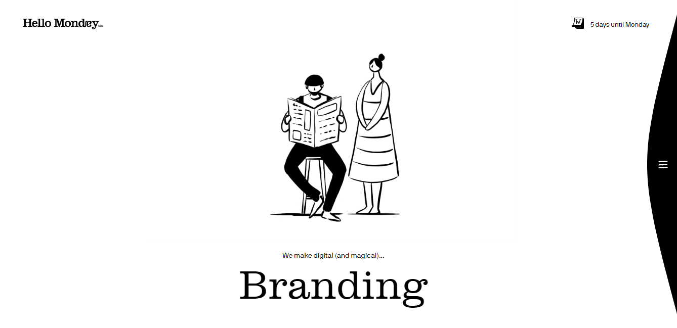
Some examples of simple interfaces to consider come from Pitch and Hello Monday. The pitch includes a clean design and headline colors and sizes that attract attention. Hello Monday uses white space to direct focus.
Design for Your Audience, Not for Yourself
Designing for your audience requires a full understanding of their behavior and preferences. From it, you’ll increase customer interests, potential leads, and gain better page indexing by the search engines. Designing for the audience starts with usability testing.
Among other things, testing the usability allows you to know what your users actually do. To do it, conduct user research and gain feedback based on your design. Also, use creative thinking to find ways to deliver the right design for the audience.
Making it for the audience benefits your website in the long run. Therefore, start listening to what your audience prefers.
Use Common UI Elements
The audience expects familiarity in design when going to your website – especially if it’s not their visit. Therefore, always follow recurring patterns in UI/UX design. Doing so provides a better user flow, as they have the basic knowledge of navigating websites similar to yours.
However, following the standard UI elements isn’t merely copying others. The best way to apply common UI elements is through research, audience analysis, and user testing. Additionally, you can learn from these websites to learn more about UI patterns.
To add more common elements to website design, include the same formatting for FAQ or About Us pages, navigational menu, and page categories. For mobile app design, add search feature and header formatting.
Keep Things Consistent
From the consistent design, you establish and maintain visitor expectations. In short, visitors know exactly what they’re getting – which allows them to find what they’re looking for with ease.
Consistency is also good for SEO, as search engines can read your website better when there’s consistency on the content, keywords, and website media.
Start by being consistent in copywriting, use of color, typography formats, and page structuring. Understand the design hierarchy that aligns with the audience’s habit. For visual content, apply the same principles for better message absorption.
Reduce User Frustration
In website design, some factors contribute to user frustration. Some of these are errors, a poor overall experience like scrolling or checking out, and slow-loading page speed. Fortunately, there are also many ways to reduce user frustration.
Apply an appropriate level of readability and improve your content maturity level. To improve the experience, adapt to short attention spans. Add a 404 error page to inform users and redirect them to another page without leaving your website.
In the long run, reduce user frustration by looking at your data. Understand what works and what needs improvement. Mostly, listen to your audience’s feedback regularly.
Avoid Dramatic Redesigns
People prefer familiarity and dislike major changes and this also applies to website design. Therefore, avoid dramatic changes to your website to maintain interest.
Make gradual changes and focus on one thing at a time. Avoid going too far and too fast from your original design. Moreover, a data-driven design is required to understand your redesign purposes.
Conclusion
When designing UI/UX, there is no one-size-fits-all approach as nothing is set in stone. However, we hope that these six best UI/UX practices help your website design efforts. Good luck.


